Proyecto: Abrasamar
Colaboración: Luis Pacheco
Objetivo: Branding
Lugar: CDMX
Year: 2024
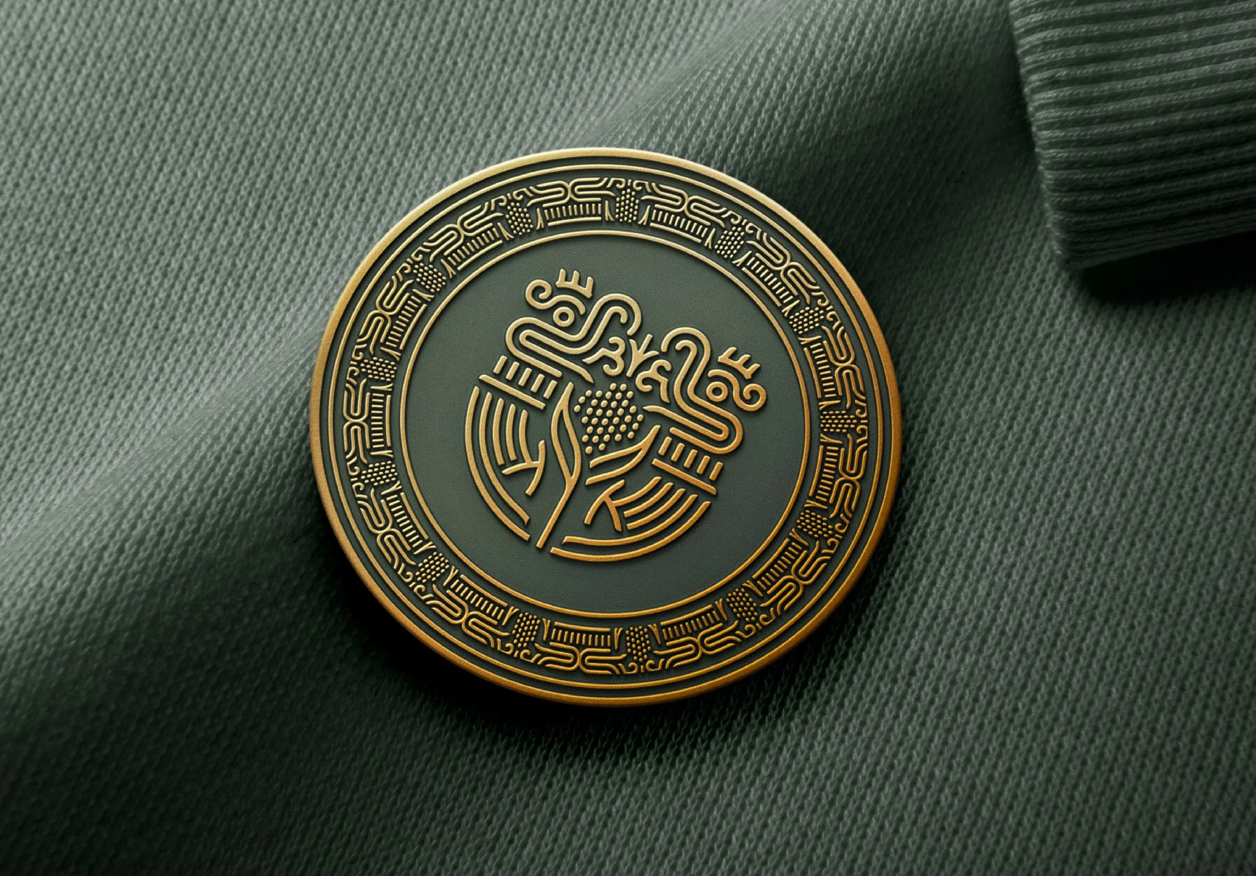
Cocina de Brasa, es un restaurante que celebra la frescura del mar y la pasión por las brasas, fusionando sabores y experiencias. El reto del diseño fue lograr una identidad visual que mezclara la esencia artesanal del mar con la sofisticación moderna, creando una atmósfera única.
El diseño de la marca se basa en una tipografía hecha a mano alzada para transmitir la calidez y autenticidad de la cocina en brasa. La palabra “mar” en el logotipo se conecta visualmente a través de olas, haciendo alusión directa al océano, mientras que el símbolo, igualmente inspirado en el mar, resalta la frescura y el toque único de la propuesta gastronómica.
El uso del verde seco, similar al tono olivo, se seleccionó cuidadosamente para evocar naturalidad, frescura y un ambiente acogedor. Aunque el símbolo y el nombre no siempre se usan juntos, ambos elementos se complementan perfectamente cuando se presentan en la comunicación visual, generando una relación fluida entre los componentes de la marca.
Este enfoque visual refleja la esencia del restaurante: un lugar que abraza la frescura marina con el calor de las brasas, creando una experiencia de sabor incomparable y un ambiente acogedor para sus comensales.
Proyecto: Estudios Churubusco
Objectivo: Rebranding
Agencia: Kommun
Cliente: Erwin Neumaier
Colaboración: Saúl Osuna
Lugar : CDMX, México
Año: 2023
Project: Suburbity
Associate designer: Luis Pacheco
Objective: Branding
Place: Cuernavaca
Year: 2023
Explora Suburbity: la agencia inmobiliaria que redefine el futuro digital de la vivienda. Una elección vanguardista para aquellos que buscan una experiencia inmobiliaria innovadora.
El símbolo es más que una imagen; es una declaración de modernidad. Fusiona de manera única la simplicidad con la profundidad. Dos techos de dos aguas convergen en una perspectiva cenital, dando forma a la letra "S" de Suburbity. Este distintivo no solo es memorable, sino que también encapsula la esencia progresiva de la agencia.
La tipografía refleja la filosofía de limpieza y modernidad. Cada letra es una declaración de legibilidad fácil, resaltando la transparencia y accesibilidad en cada interacción.
Rompemos con la tradición al usar tonos morados para transmitir vitalidad y originalidad. Estos tonos vibrantes simbolizan energía, creatividad e innovación, marcando la diferencia frente a las agencias inmobiliarias convencionales.
Suburbity no es solo una marca; es una promesa de modernidad y visión de futuro en cada paso del camino.
————————
Explore Suburbity: the real estate agency redefining the digital future of housing. A avant-garde choice for those seeking an innovative real estate experience.
The symbol is more than an image; it's a statement of modernity. It uniquely merges simplicity with depth. Two gabled roofs converge in an overhead perspective, shaping the letter "S" of Suburbity. This distinctive mark is not only memorable but also encapsulates the progressive essence of the agency.
The typography reflects the philosophy of cleanliness and modernity. Each letter is a statement of easy readability, emphasizing transparency and accessibility in every interaction.
Breaking with tradition, we use shades of purple to convey vitality and originality. These vibrant tones symbolize energy, creativity, and innovation, setting Suburbity apart from conventional real estate agencies.
Suburbity is not just a brand; it's a promise of modernity and a vision for the future at every step of the way.
The new Mexican airline, Aerus, is our latest creation.
Our brand is modular, modern, and sophisticated. Inspired by "vital systems," our graphic system reflects our attention to structure, systems, and the dynamism upon which electromagnetic waves are used to measure distances, altitudes, directions, and speeds of aircraft.
Project: Aerus Airlines
Client: Grupo Herrera
Agency: Kommun
Objective: Branding
Place: Monterrey
Collaborative designer: Pepe Cacho
Year: 2022
Awards:
CLAP Design Awards 2023
Platinum - Best Brand
Selection - Best Design system
Project: Correos de México
Objective: Rebranding
Agency: Maker Media Group
Place : CDMX, México
Year: 2019
Note: Non official proposal.
Project: Moshi Moshi
Client: MYT Diseño
Objective: Branding
Place : CDMX, México
Year: 2017
Proyecto: Zagala Restaurante
Cliente: Alonso Perochena
Objetivo: Branding
Lugar: CDMX
Año: 2022
Colaboración: Noe Silva
Nuestro nombre es un juego de imaginación que nos transporta a los agrestes paisajes de los Pirineos. A esas montañas verdes, as sus cimas cubiertas de nieves y a las acogedoras casas de grandes vigas de madera desde donde se desprenden los aromas y sabores de la cocina tradicional española. Zagala nos sugiere imaginar a la joven que vive en aquella región, quien mantiene con amor y esfuerzo, las grandes recetas que cocinaban sus abuelos, respetando ingredientes de origen, naturales y seleccionados, pero con guiños modernos que convierten un rico platillo del ayer en una sorpresa culinaria de hoy y siempre.
Project: De Rancho & Puerto
Objective: Branding
Place: CDMX
Year: 2020
Collaboration: Luis Pacheco
Modeling: Ian Parra
De Rancho y Puerto Es una empresa familiar mexicana catalogada como carnicería boutique que se dedica a la venta de carne de ganado, pescado y ave con certificado de libre pastoreo y sin hormonas. Su tienda es en línea con servicio a domicilio.
La imagen está representada por un Alebrije, que es un tipo de artesanía originaria de México, los alebrijes son seres imaginarios conformados por elementos fisonómicos de animales diferentes, una combinación de varios animales, no solo fantásticos sino también reales que forman un ser alucinante.
Nuestro Alebrije, mitad toro mitad pez, representa un homenaje a la tierra y al mar como fuentes de alimentación, más allá de la imagen clásica de una carnicería.
••••
Brand identity for De Rancho y Puerto
De Rancho y Puerto is a Mexican family business classified as a boutique butcher shop that sells free grazing, hormone-free certified cattle meat, fish, and poultry. Its store is online and offers a convenient home delivery service.
The brand is represented by an Alebrije, a type of handcraft native to Mexico that embodies colorful imaginary and fantastic creatures made up of physiognomic elements of different animals.
Our Alebrije, half bull half fish, represents a homage to land and sea as sources of food, going beyond the classic image of a butcher shop.
Project: Tren Maya
Objective: Branding
Agency: Maker Media Group
Designer: Luis Pacheco
Designer: Pepe Cacho
Place : CDMX, México
Year: 2019
Project: Melsúu
Objective: Branding
Place : Rosarito, Baja California
Year: 2019
Collaboration: Luis Pacheco
Melsúu is the branding for a restaurant in Ensenada, BC.
The brand name pays tribute to the history and tradition of the Kiliwa, an ethnic group with deep roots in the northern lands of Baja California. In the language of this people, melsúu means blue.
The brand is a representation of the supreme deity of the Kiliwa mythology, Meltí, which symbolizes wisdom, magic and death. Meltí means Coyote-People-Moon.
Project: Volaris
Agency: Ideograma Consultores
Involvement: Symbol development
Place: CDMX, México
Year: 2005
I had the honor of being part of the team that developed the Volaris brand at Ideograma Consultores.
My specific involvement was in the development of the pixelated star. Concept that was defined by Juan Carlos Fernández and Pep Palau. A project where teamwork was essential to give life to one of the most emblematic brands of Mexican aviation.
This was a project developed entirely by Ideograma Consultores when I worked for them.
The work shown here is the result of the great talent of the entire team.
Project: Puebla
Objective: City Branding
Place: Puebla
Year: 2020
Collaboration: Luis Pacheco
The concept, HERITAGE, is founded on five pillars: identity, tradition, culture, heritage and people.
Each of these pillars emerges from the beautiful volcanic landscape of Puebla, to the history, the characters, the gastronomy, the collective memory, the art, the architecture. A destination brand that connects with the past, looks to the innovation of the future and reflects a rich, vast, proud Puebla of incomparable tourist significance.
Project: Aitana
Client: Grupo Ituarte
Objective: Branding
Place: CDMX, México
Year: 2016
Project: Gobierno de México
Objective: Branding
Place: México
Year: 2019
Project: Potion Sneaker Cleaning
Objective: Branding
Place: México
Year: 2020
Project: Unilogic
Objective: Rebranding
Place : México, City
Year: 2020
Collaboration: Luis Pacheco
Project: Industrial by Público
Client: Allan Legaspi
Objective: Branding
Place : CDMX, México
Year: 2017
Project: Latamdocs
Objective: Branding
Place: Latam
Year: 2020
The pandemic has underscored the need for better and more timely medical care.
That is why the Latamdoc project was created, which from your smartphone allows you to enter in direct contact and have real-time consultations with doctors from all over Latin America.
Project: Cocina Abierta
Client: Grupo MYT
Objective: Branding
Place: CDMX, México
Year: 2016
Project: Avanza
Objective: Branding
Place: Cuernavaca, México
Year: 2015
Project: Guava Lake Community
Client: Rodrigo Salgado
Objective: Branding
Place: Tequesquitengo, México
Year: 2018
Proyecto: Alex Castro
Objetivo: Branding
Lugar: CDMX, México
Año: 2017